It’s human nature to want to anchor an intangible concept to a tangible context.
This impulse can be seen throughout the evolutions of web development. Content was contained in the context of the webpage, which was conceptually almost no different from the printed page when it was created. A webpage had a set design and dimensions. And the tools used to create the page were designed to anchor the content to the webpage by giving it a static set of features that, once set, were difficult to change—much like trying to change ink on a page.
But with the exponential rise of different content delivery devices and channels in the past decade, content producers found it hard to keep up with creating so many specialized versions—or views—of the same content item for each delivery device and channel.
And as new ways of interacting with content were developed concurrently, like voice assistants and social media streams, we started realizing that we really can’t think of these items as pages at all anymore.
We’re being forced to slowly start removing the idea of content from the tangible context we’ve always known. So, how do you deliver content without delivering a tangible thing?
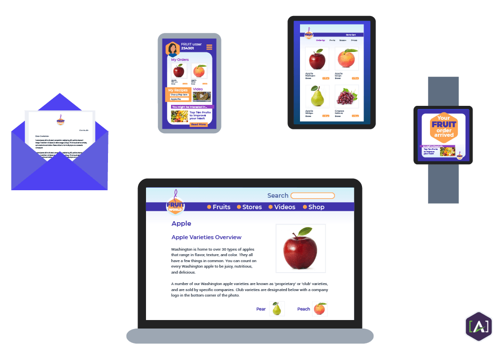
Instead of creating three different home pages optimized to run on desktop, mobile, and tablet, how about we create one that is flexible enough to adapt to all three? The way content is distributed is dramatically changing web development and the way we view content in general.
Content engineers are the evangelists and facilitators of this change. We help brands make the industry wide transition away from large blobs of unstructured, static content to small, structured, form-free content developed with adaptability in mind.
Let’s take a closer look at how content modeling has affected how we interact with one of the biggest catalysts of this evolution—content views.
What is a View?
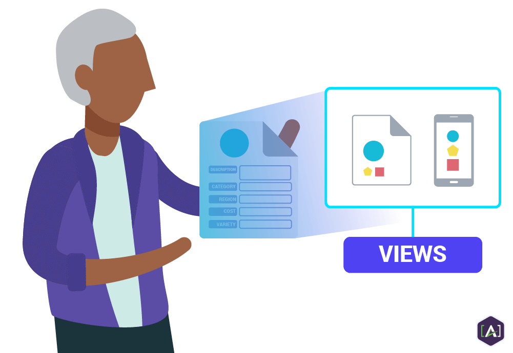
Views are all the different ways a content item is represented across channels, devices, and preview points.
How Views Fit into the Content Model
Content types,
elements, and
attributes are all distinct parts of a
content model.
Views are an application of that model.
It is important to note that brands that don’t practice content modeling can still have views. Let’s say a company that creates a page on a desktop site and a different version on a mobile site from scratch—those two entities can still be considered views. But this process is made infinitely more efficient through content modeling.
Different views are created quickly and easily by working from a content type and applying these key tenets of content modeling:
Start with Modular Content
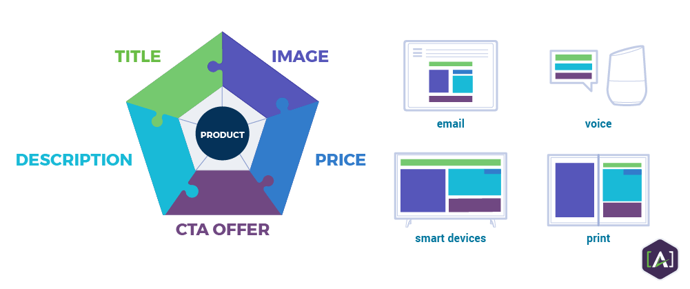
To make content flexible enough to fit any number of contexts, you first need to break it up into small, reconfigurable pieces.
Once your content is broken up into content types and then their individual elements, you can determine how to adapt the type to best fit an individual view. What elements should be prioritized when screen space is limited? Should certain elements be dropped all together in a certain view? Shifted around? Should a different text length be used? An alternate image? With modular content, these decisions can be easily implemented.
Once these guidelines are set, a content item can be automatically populated into the optimized layout for that view and manual adjustments can be made if needed.
Separate Content from Presentation
Once content is modular, it then has to be freed from the presentation layer.
As mentioned previously, the language originally used to build webpages tied content to formatting. This meant there could only be one view—desktop—and even that one view was difficult to update as style choices like font and color would have to be updated on every individual page.
There are many different techniques, philosophies, and tips on how to best solve this problem, but the vast majority come down to this: make sure that the
Content Management System that denotes things like headings, paragraphs, and lists is kept separate from the Front-end —the visual design choices.
Go Responsive (Adaptive)
Responsive design is an approach to web design with adaptability in mind. The advent of media queries allows a page to collect information about how and where that content is being displayed. Proportion-based grids and flexible images make it possible to automatically adjust the content accordingly. So, content on a desktop that’s 1292 pixels wide might display a four column layout, while content on a mobile phone might display as a single column.
There are also different techniques, philosophies, and tips on how to best design a site that renders well across all devices and channels.
Putting Your Content Model to Work
At this point, the content model can be tailored for specific project requirements and team preferences. As the content model is in the process of being drafted, ask yourself: who is going to be using this information? What would they like to see included in the model? What would be most helpful to them? How would they prefer it to be recorded?
Content engineering is as much about setting up systems that promote ways to open up channels of communication across teams as it is about producing the content deliverables themselves. Build the content model that will best inform and empower those at every point of the creation and distribution process.
With the right features in place and the teams properly supported, it’s time to put your content model to work.
Read the 6 Benefits of a Core Content Model to see how all these pieces come together and allow for content to be automatically distributed across any channel and easily personalized for different audience segments. If your organization is ready to build and implement a content model,
reach out to the experts at [A] for assistance in any form.
Contact Us for a Free Consultation.