![[A]](/site/img/logo-color.svg)

.NET MAUI (Multi-platform App UI) is a powerful framework that allows developers to create native, cross-platform applications using a single codebase. With .NET MAUI, you can build apps that run seamlessly on Android, iOS, macOS, and Windows, leveraging the best features of each platform.
Material Design 3, introduced by Google, is a comprehensive design system that helps create intuitive and beautiful user interfaces. Its guidelines ensure consistency and accessibility across different platforms, making it a cornerstone for modern UI/UX design.
These UI patterns are especially useful when building components like an Android bottom navigation bar or a custom tab system that looks and feels consistent across platforms.
In this post, we'll explore the guidelines for implementing a tab navigation bar in .NET MAUI following Material Design 3 principles.
Understanding SimpleToolkit.SimpleShell
SimpleToolkit.SimpleShell developed by Radek Vymětalík and available on GitHub, is an open-source plugin designed to simplify the development process in .NET MAUI. It provides a range of pre-built UI components and functionalities, making it easier to implement complex features with minimal effort. The toolkit is particularly useful for developers who want to create consistent and visually appealing applications without delving deep into custom code for every component.
Setting Up SimpleToolkit.SimpleShell
1. Add SimpleToolkit to Your Project: Open the NuGet Package Manager and search for "SimpleToolkit.SimpleShell" Install it into your MAUI project or add the package reference to your .csproj project:
<PackageReference Include="SimpleToolkit.SimpleShell" Version="4.1.3" />2. Configure SimpleToolkit: In your MauiProgram.cs, add the necessary configurations to use SimpleToolkit components:
using SimpleToolkit;

public static class MauiProgram
{
    public static MauiApp CreateMauiApp()
    {
        var builder = MauiApp.CreateBuilder();
        builder
            .UseSimpleToolkit();
        return builder.Build();
    }
}
Implementing a Material Design Navigation Bar in .NET MAUI
Inheriting from SimpleShell: By inheriting from SimpleShell instead of the standard Shell, you gain flexibility to customize the navigation experience.
Constructor Initialization:
- Initializes components and sets the binding context.
- Adds tabs using the AddTab method.
- Sets the initial selection for the tab bar.
- Subscribes to the Loaded event.
Loaded Event Handler: Adjusts the tabBarView margins and padding based on safe area changes to ensure the UI looks good on various devices.
Adding Tabs: Dynamically adds tabs to the tabBar with specified pages and titles.
Tab Selection Handling: Handles navigation when a tab is selected, directing the app to the corresponding page.
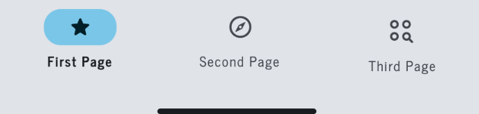
public partial class AppShell : SimpleShell
{
    bool loaded { get; set; }

    public AppShell(AppShellViewModel vm)
    {
        InitializeComponent();
        BindingContext = vm;

        AddTab(typeof(FirstPage), PageType.FirstPage);
        AddTab(typeof(SecondPage), PageType.SecondPage);
        AddTab(typeof(ThirdPage), PageType.ThirdPage);

        tabBarView.SetSelection(0);

        Loaded += AppShellLoaded;
    }

    private static void AppShellLoaded(object sender, EventArgs e)
    {
        var shell = sender as AppShell;

        shell.Window.SubscribeToSafeAreaChanges(safeArea =>
        {
            shell.tabBarView.Margin = new Thickness(safeArea.Left, safeArea.Top, safeArea.Right, 0);
            shell.tabBarView.TabsPadding = new Thickness(0, 0, 0, safeArea.Bottom);
        });
    }

    private void AddTab(Type page, PageType pageEnum)
    {
        var tab = new Tab { Route = pageEnum.ToString(), Title = pageEnum.ToString() };
        tab.Items.Add(new ShellContent { ContentTemplate = new DataTemplate(page) });

        tabBar.Items.Add(tab);
    }

    private void TabBarViewCurrentPageChanged(object sender, TabBarEventArgs e)
    {
        Shell.Current.GoToAsync("///" + e.CurrentPage.ToString());
    }
}

public enum PageType
{
    FirstPage, SecondPage, ThirdPage
}
Replacing the XAML: The following code outlines the structure of the new XAML Shell, so the screen is set on 2 main sections: Header and Body. However, SimpleToolkit allows you to set more custom sections if needed. Please refer to the official documentation for further details.
<ss:SimpleShell
    x:Class="Demo.AppShell"
    xmlns="http://schemas.microsoft.com/dotnet/2021/maui"
    xmlns:x="http://schemas.microsoft.com/winfx/2009/xaml"
    xmlns:ss="clr-namespace:SimpleToolkit.SimpleShell;assembly=SimpleToolkit.SimpleShell"
    Shell.FlyoutBehavior="Disabled">

    <!-- Tabs -->
    <TabBar x:Name="tabBar">
    </TabBar>

    <!-- Root Page Container -->
    <ss:SimpleShell.RootPageContainer>
        <Grid>
            <ss:SimpleNavigationHost
                x:Name="pageContainer"/>
            <controls:TabBarView
                x:Name="tabBarView"
                VerticalOptions="End"
                HorizontalOptions="Fill"
                CurrentPageSelectionChanged="TabBarViewCurrentPageChanged"/>
        </Grid>
    </ss:SimpleShell.RootPageContainer>

    <!-- App Bar Header -->
    <ss:SimpleShell.Content>
        <Grid
            RowDefinitions="Auto, *" >
            <Grid
                x:Name="shellHeader"
                Grid.Row="0"
                ColumnDefinitions="103, *, 70">
                <Label
                    Grid.Column="1"
                    TextColor="Transparent"
                    Margin="0"
                    HorizontalOptions="Center"
                    VerticalOptions="Start"
                    Text="App Header"/>
            </Grid>
            <ss:SimpleNavigationHost
                Grid.Row="1"/>
        </Grid>
    </ss:SimpleShell.Content>
</ss:SimpleShell>
Customization
Custom controls: In order to follow Material Design 3 guidelines, we need to include a set of custom controls that allow us to define the layout of the navigation bar, such as the layer, the tab view, and the event to trigger the UI updates.
To match branding needs or visual hierarchy recommendations, developers can define a 3 color palette or use a material design color palette generator to customize tab styles and states. This flexibility helps you fully align with Material Design 3 features while maintaining a unique app identity.
The TabBarEventArgs is in charge of setting the current page of the selected tab.
namespace Demo.Views.Controls;

public class TabBarEventArgs : EventArgs
{
   public PageType CurrentPage { get; private set; }

   public TabBarEventArgs(PageType currentPage)
   {
       CurrentPage = currentPage;
   }
}
The TabLayer displays the three tabs on the navigation bar, and sets the styles and icons to use.
The TabBarView focuses on the UI animations, and events to reflect the desired result. This includes the rounded selected tab background.
Result
Conclusion
Implementing a navigation bar in .NET MAUI following Material Design 3 principles is a highly effective way to ensure a consistent and intuitive user experience across multiple platforms.
Adopting .NET MAUI and SimpleToolkit allows developers to embrace a unified approach to app development, enhancing productivity while incorporating Material Design 3 features that bring visual consistency and accessibility to your navigation bar.. I encourage you to explore these tools further and integrate them into your development projects.
Want your .NET MAUI app to look sharp and feel seamless across platforms?
At [A], we specialize in structured content and UI systems that scale — so whether you're implementing Material Design 3 or customizing navigation, we can help you do it right the first time. Let’s talk.